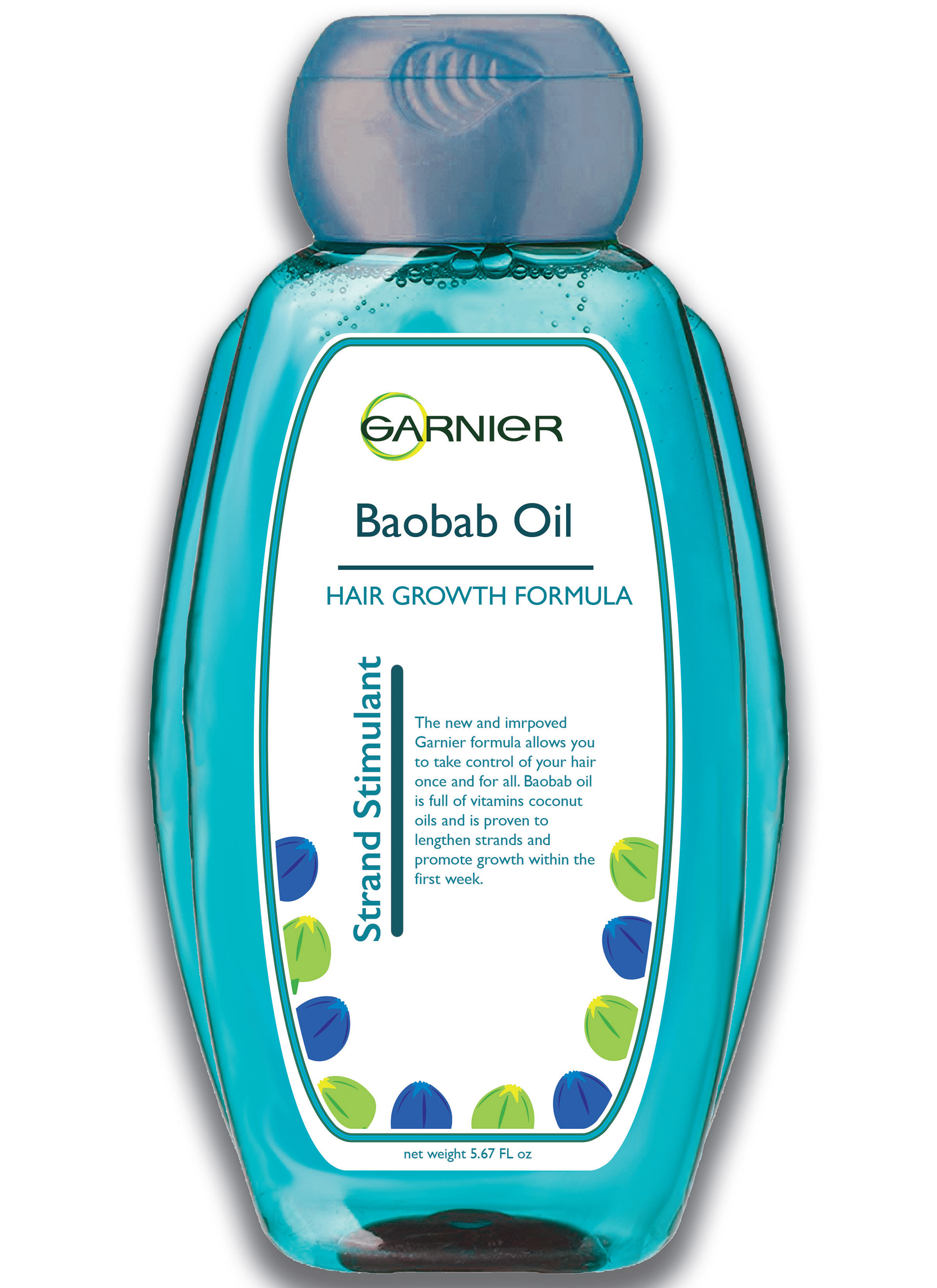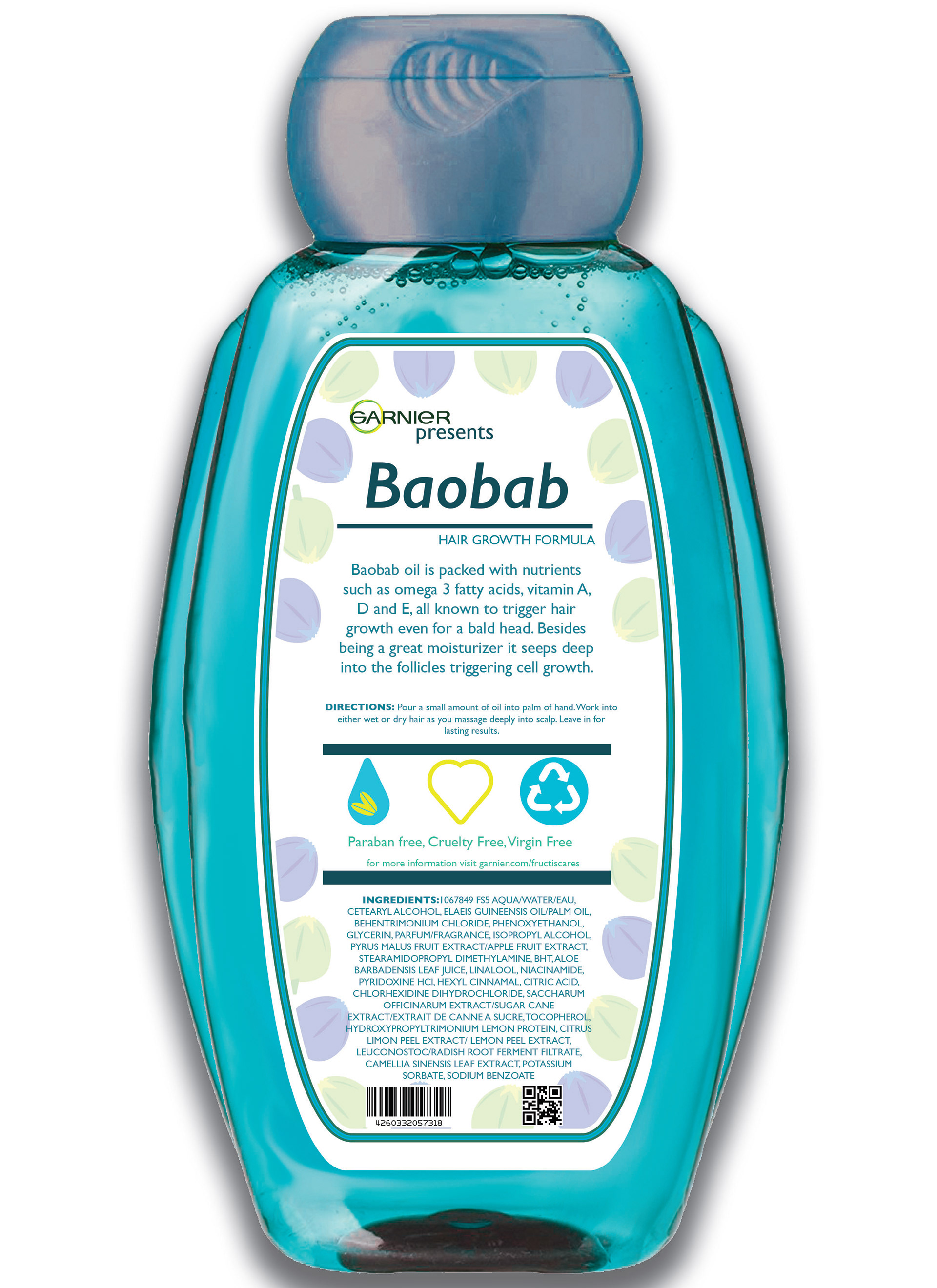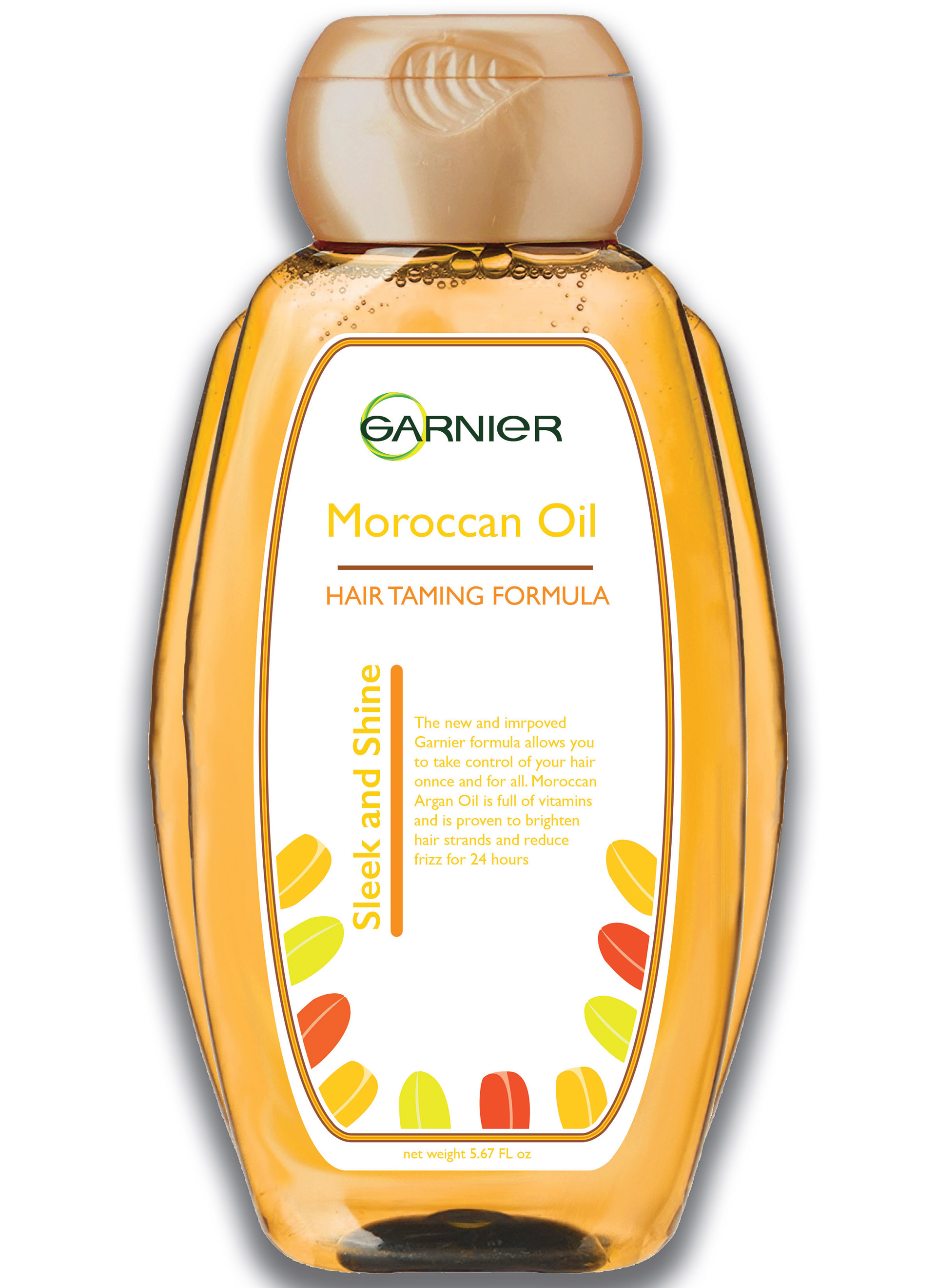
Brand redesign is necessary when an opportunity appears. With modern day health and beauty products hitting the shelves everyday, it is important to freshen up older brands. For Garnier, I wanted to redesign the logo by turning the green dot into a vector image that holds the circular image, while incorporating a twist to represent strong hair strands.
The packaging used is a 'throwback' package that stands out against traditional bottles. Ridges are added for both aesthetics and practical use for better grip while handling the product in the shower.